Palette Vibe: Fast, Cohesive Color Palettes with Accessibility in Mind
By Quentin Hnilica • Tue Nov 04 2025 • ~ min read
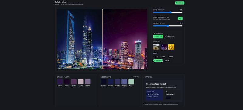
Great palettes don’t happen by accident—they’re discovered through quick iteration, contrast checking, and real-world testing. Palette Vibe https://www.palettevibe.com/ is a lightweight tool built for designers, developers, and brand builders who need production-ready palettes without the guesswork. Start from an image or a “vibe,” explore harmonies, validate WCAG contrast, and export tokens you can drop straight into your app or style guide.
WHY WE BUILT IT
Picking colors is easy; picking colors that work everywhere is hard. Social thumbnails, hero sections, buttons, charts, and print pieces all ask different things of a palette. Palette Vibe gives you a tight workflow to explore combinations, ensure contrast, and keep brand consistency across platforms.
WHAT YOU CAN DO WITH PALETTE VIBE
• Generate palettes from images, keywords, or manual picks
• Explore harmonies (analogous, triad, complementary, split-complement, monochrome)
• Validate accessibility with WCAG AA/AAA contrast checks for text, UI, and charts
• Lock favorite swatches, then shuffle supporting colors around them
• Create semantic roles (Primary, Secondary, Accent, Surface, Muted, Success, Warning, Danger)
• Export HEX / RGB / HSL / JSON tokens (and Tailwind-friendly formats)
• Copy CSS variables for instant drop-in theming
ACCESSIBILITY AND REAL-WORLD USAGE
Palette Vibe keeps contrast front-and-center so you never ship unreadable UI. Test heading/body/button pairs, hover/focus states, and chip/badge backgrounds against light and dark surfaces. If you see a borderline ratio, nudging lightness/saturation updates the entire set while preserving harmony.
WORKFLOWS THAT SAVE TIME
• Branding: Start with a logo or mood image to extract an initial palette, then refine.
• Web & App UI: Define semantic roles once, export tokens, and theme components consistently.
• Marketing & Social: Build high-impact color stacks for thumbnails, carousels, and landing pages.
• Data Viz: Pick chart-safe hues with clear separations and test text on filled bars/lines.
HARMONY HELPERS (WITHOUT THE THEORY TAX)
Use guided suggestions to explore adjacent hues for calm UIs, triads for energetic compositions, or complementary pairs for strong callouts. You get creative range without falling into clashy or dull territory.
HANDOFF WITHOUT FRICTION
Export your final set as JSON tokens or CSS variables, or copy Tailwind config snippets to align design and development. Save named presets for campaigns, clients, or product themes and re-use them later.
TIPS FOR YOUR FIRST PALETTE
- Start from an anchor: pick one hero hue that represents your brand or campaign mood.
- Lock it, then let Palette Vibe suggest supporting hues from harmonies.
- Define roles (Primary/Accent/Surface) and test buttons, links, and headings against both light and dark surfaces.
- Adjust lightness until WCAG shows AA/AAA where you need it.
- Export tokens and drop them into your project; iterate with small nudges rather than big overhauls.
WHEN TO USE PALETTE VIBE
• New brand or rebrand “starter kit”
• Seasonal campaigns that need a distinct look without breaking brand rules
• UI refreshes where contrast and clarity are slipping
• Designers/developers who want one truth source for colors across web, app, and print
BOTTOM LINE
Palette Vibe turns “I think this looks good” into “I know this will work.” Generate cohesive palettes, validate accessibility, and ship with confidence—fast.
Try it here: https://www.palettevibe.com/